Posts

PROJECT 3: Unwrap & Texture

Back to the fun stage! Finally! Well, not the unwrap per se, that's part maths, and maths is evil. But texturing! I studied the brief a lot for this stage, and I'm glad to say I think I learned the most out of it as well. Long gone are the times where I trial-errored inputting the roughness/metallic values in thousand times because I did not understand what any of them does and I cried myself to sleep not knowing where I went wrong when I finally put my assets into UE4 and they all just looked like dark, shiny unicorn poop. I finally got it! The white means matte, the dark means disco balls!

The source of my epiphany was mainly me trying to follow Matt Wilkins' amazing breakdown and working on the textures in Photoshop. Breaking everything down to Photoshop layers helped immensely. I helped myself out by importing my bakes (from Substance) to 3DCoat which has an awesome bridge with Photoshop, so I was not in blind and I saw every change I made on the texture in the viewport immediately (and could handpaint on the model directly as well). I still don't get why Substance only has an "Export-to-Photoshop" feature, biiiiiig let down. 

As per Matt Wilkins' suggestion in his breakdown, I created a tileable 'dirt-colour-interest-detail' texture which I then used in almost every asset (by just changing colours via PS's Selective Color). Big help in wood texturing, more subtle in fish skeleton bone, added great hints of hues in the golden bird cage and overall made the process much more enjoyable than if I had to add interest individually by hand to every asset :) I still did some overpaints because sometimes it was hard to adhere the texture to the UVs (note for next time: this is why you should assemble UVs as straight as you can, and if possible, all in the sime direction!). ¨


Another thing which blew my mind was the use of Curvature Map. I thought I had lost all the details from Zbrush when baking, but this thing - man, this awesome thing! It just brings it all back! It took me some time to figure out the opacity and blending mode settings and in some cases, I had to clean it up manually, but if there was an MVP award for most useful texturing trick, Curvature Map takes it home, no question. With lacquered wood and some other assets, I boosted the curvature map by lassoing over some wear and tear and the result was even nicer.

In the brief it was advised not to add AO to textures, but with some assets I went and did it anyway, just very subtly.


At the end of the texturing process, I brought all assets back to Substance Painter just because I like the shaders and rendering there more. I exported the final Targas from there as well, with Roughness in Blue channel, nothing in Green channel, metallic in Red channel, as it was asked of us in the brief. Overall, this must have been the most fun I've had when texturing in a while and I would love to work in this style once again after I finish this project!

PROJECT 3: The devil named Retopo

Off to one of my least favourite parts, retopology. Where are the clever robots when we need them? Even Elon doesn't like spending much time on it, judging by the complexity of the cyber truck (which I btw love, you go Elon), so I don't get why we still have to endure this torture in this day and age. 

For some of the assets, mainly the organic ones, I used a combination of ZRemesher and hand retopo-ing. I found ZRemesher provided great results on wider areas, not so great results on pointier or more detailed areas (even when trying to retopo with polygrouping, ZRemesh guides, topology brush and other thousand "shortcuts" I looked into before giving up and, defeated, coming back to my eternal frenemy 3dsMax).

Beginning of my bird retopo -> blue is Zremesh, rest is by hand.
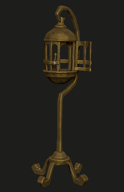
Final retopo


For other assets, I already had a pretty solid basemesh and in those cases, it became mostly about adding loops and conforming to topology. I constantly tried to keep in mind my budget, which was (according to the SoT brief, 2000-4000 verts per object). 


Overall, I had no major issues with retopo as the assets weren't super complex (apart from the fact that it was a boring process). I "watched" a whole season of Brooklyn Nine-Nine while doing it so I can't complain THAT much anyway :D Though in retrospect I am realising, if my sculpting workflow was cleaner with some of the assets, such as the fish skull, I wouldn't have had to spend that much time on its retopo (I left a lot of stuff dynameshed, where I now think I should have Zremeshed, subdivided and sculpted over it again, well, I learned for the next time). 

PROJECT 3: More sculpting


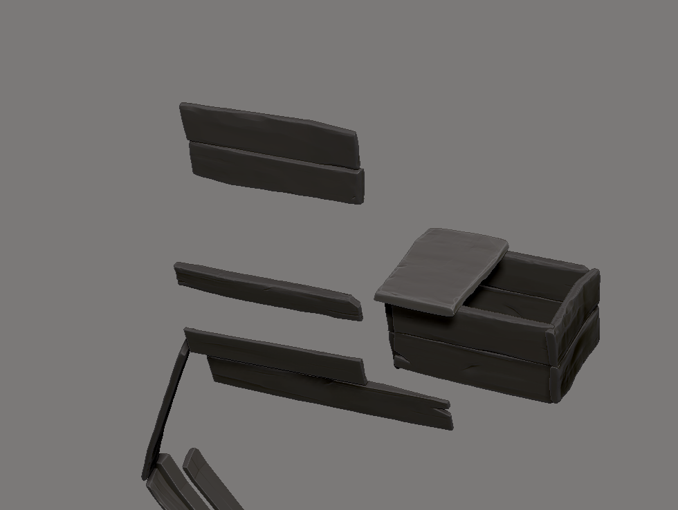
Sculpting the environment wasn't as tedious as I thought. I was afraid of the cloth at first but after studying some Sea of Thieves reference, I found that the cloth was even simpler, flatter than I thought, so there was no need for overdoing it. Still, I feel like I could have done better with some of the cloth shapes, but I did not have time to do studies and learn proper cloth dynamics. I am noting this as a thing to focus on later in my post-uni projects though! One thing that went better than I expected were the floor tiles. I only sculpted on the few pieces of wood under my cloth (around 4 or 5 of them), which I then re-shaped, re-sized and dynameshed to create the floor texture, sculpted over those a little and that was it. If the floor was made for a game environment, not just a small diorama, I would have probably created a tileable texture out of it, but I saw no need to do it in this case.

Reference:


My sculpts:


I re-used the planks once more when sculpting the box/crate asset. On the left you can see how so (assembled the previous plank sculpts, then sculpted over them to make them look more similar to the concept).


One asset I was looking forward to sooooo sooo much was the little parrot. I found so many amazing ones in the game and I couldn't decide which one to pick. As part of me trying to be more active on my art instagram (https://www.instagram.com/tereza.rozumkova/), I decided to ask my followers to help me pick the design I should go for. The parakeet won over the classic parrot by a small percentage :)
When sculpting this one, I did not have any major issues, it was mainly just time consuming (but the most fun one as well).


PROJECT 3: Sculpting fish skeleton and additional assets

A small update on my sculpted assets. I feel like it's either taking me way too much time because I haven't sculpted in such a while, or because I'm naturally slow, or because I'm putting too much time and effort into this stage (if there is even such a thing as too much). Now that these main bits of the scene are done (apart from the parrot boi, leaving the best for last), I want to work on the rest of the scene very fast and learn to not be too precious about secondary assets. 

All in all, I do like how the sculpts turned out. I got back into the flow of using my shortcuts and customised UI, I remembered which brush is best for flat areas and how to fill some areas in without disrupting the flatness (hPolish + alt rules) and I genuinely enjoyed the process. I am thinking of creating an engraving for the plaque on the bottom of the fish skull, though I'm not sure what it would read. Maybe a badass name of a pirate who captured the striking specimen? :D I'll think about it and maybe add it in before I start texturing.


Concepts: 

Lastly, a small blooper from the basemesh preparation stage. I've been goofed on so much by both 3dsMax and Zbrush during this whole process :D


PROJECT 2: Creature concept brief


PROJECT 3: Basemeshes & ZBrush

For the past week I have been mainly working on the three main assets for my SoT scene and well, it's been a ride. I've forgotten a lot about hardsurface modeling and in retrospect, I probably should have not picked such diverse subjects for my matrix -> picking organic character, 2D concepting and then 3D prop/hardsurface meant that I had to switch into different modes every few weeks and remember different things about all I knew in each discipline numerous times and that took way more time than I had at hand. Good thing is, for my FMP I've chosen a pretty consistent topic so I have hopefully already learned from this mistake! :D 

Anyway, the stage where I had to prepare the basemeshes for Zbrush was by far the most difficult at the start. Meeting the old friends called NGons, rat nests and control loops was a memory I'm not eager to revisit; nevertheless, I pushed through it, frontloaded my meshes as much as I could to save myself some certain tears in Zbrush and I'm happy to say that I think it was worth it, as the sculpting stage was a lot of fun and reminded me why I don't hate 3D as much as I thought I did. 


The following are screenshots from Zbrush where I played with materials and render settings to get an idea of what to shoot for later on in Substance:


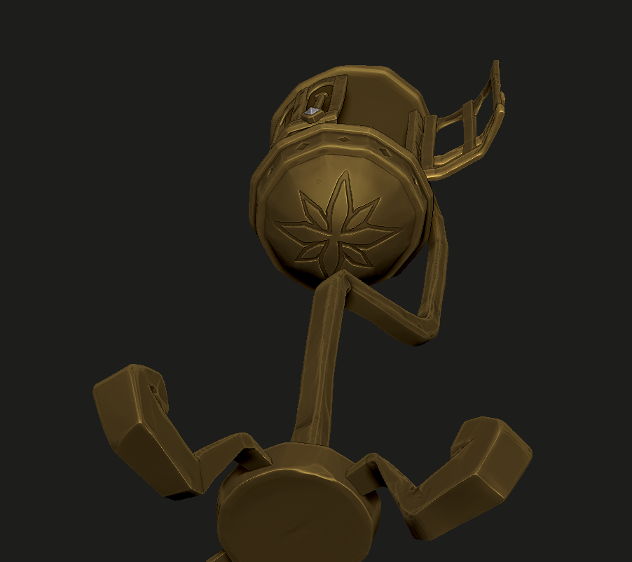
Above: some alphas I created in Photoshop to add the engraving from the concept.


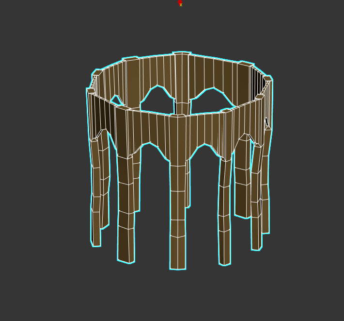
Above: Some WIP shots from Zbrush and 3Ds Max. The arch was especially challenging as I didn't know what method to use for it. I first tried to connect the edges and keep it as one mesh but after re-visiting the concept and hunting for some in-game screenshots of the actual modelled cage, I noticed that the bars are overlapping the arches and it would be easier to have them as separate meshes.

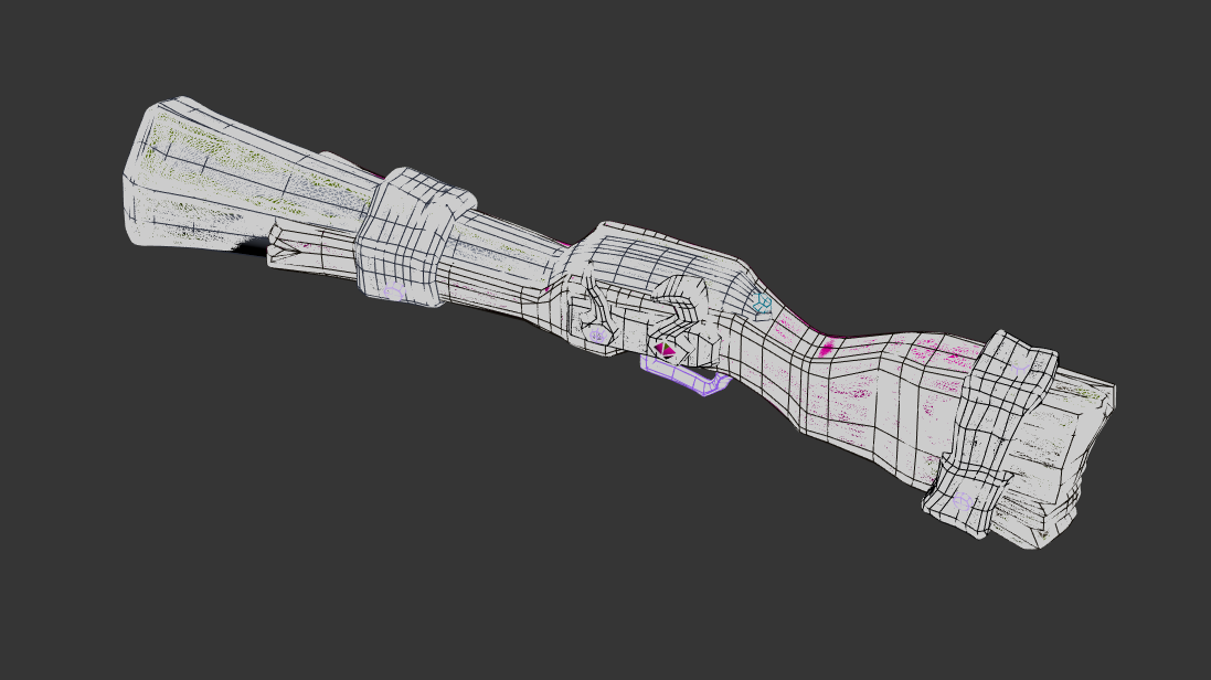
The gun took some figuring out as well. The concept wasn't as descriptive as the others and I could not find any indication of size specs, so I tried to guess the proportions and size of SoT characters and kind of wing it according to those. I also found some nice Blunderbuss model screenshots from the in-game shop. Not the exact one I was supposed to model but it was helpful in some minor things like the shape of the inside of the gun's head or the fidelity of detail in materials. Renders from Zbrush: 


High poly stage, turbosmooth in its full beauty.


The fish skeleton is still in a bit more of a WIP stage. I put a lot of time and effort in trying to follow the concept as close as I could to achieve an appealing shape. Now I'll get onto sculpting the teeth and adding wear&tear to the rest of the skeleton. I'm now also deciding whether to take these main assets to finish now (retopo, UV, bake, textures, etc.) to have them finished earlier (but FINISHED), or if I should try to speed sculpt the rest of the scene to keep it all consistent.

PROJECT 1: Handpainted texturing


It would be no lie if I said I am terrified of this stage. My only previous encounter with purely handpainted texturing was in my first year (https://sketchfab.com/3d-models/lighthouse-diorama-8d33330436604496ac77b0aa7c6c0a9a) and though it did not end up being a disaster, I remember spending an ungodly amount of time on it before I made it look presentable. 

To prepare myself as much as possible, I watched many tutorials by amazing artists and made a whole page full of notes. I also studied a lot of current Riot Games artists, such as Yekaterina Bourykina, Cody Bunt and Vlad Bacescu. The following is a mashup of all my notes I am sure I will come back to every time I texture before they're engraved in my long term memory. Disclaimer: it is probably very hard to orient in the notes as they're made mainly for my chaotic brain to understand, so if you're only interested in how my texturing went, please skip the wall of text and scroll down to see some screenshots! :) 


NOTES
- Establish lighting - usually in LoL this would be top-down.
3D Coat Hotkeys  and features to know mainly from here:
- 5: smooth shade
- 1: flat shade (always handpaint in this - fun fact, in my first year handpainted character project I had no idea this feature exists, painted the whooole thing up in Smooth Shade and then almost got a heart attack when exporting textures to Sketchfab and them not looking ANYTHING like the textures I saw in 3dCoat, fun times)
- Ctrl + P: view in Photoshop (When adjusting layers in PS, do not use folders as it rearanges the hierarchy when saved in 3DCoat)
- 0: Palette (pick colours from your reference directly)
- Set custom hotkeys by pressing END + Hotkey. Sliders like brush size can be adjusted in Windows > Sliders.
- The "eyeball" icon = super useful, hides your objects. Ctrl + X to get them back.
- If adjusting model in 3DsMax, replace the save and go to Import > Replace Geometry (make sure to keep same texture size)
- Edit > Edit Projection in External Editor -> MAGIC
- Caps Lock: Hides the yellow circle brush indicator
- Camera > Rotate around last draw point


Learned from: Texturing Metal with Form by Kelvin S Tan
- Block out design roughly but exactly (if you blur your eyes out from a distance a lot, all shapes should still read well together -> always keep large - medium - small on mind)
- Always think about the forms and check back on them. With metal, it's good to think about the bends and how they curve around things
- If you start working in colour, take print screens and desaturate in PS often to check values.
- It is okay to exaggerate values in handpainted style
- Paint highlights in edges to show where they come to a point, think about lighting - what direction is the plane facing? How intense will the light be?
- ZOOM OUT very often, make sure your model is readable both from up-close as well as from far away
(3dcoat brush preset, second one from the left hand side)
- When working on trims, follow your geometry as best as you can
- Do not render one thing out while leaving everything else behind. You want to have a cohesive lighting and for this you should aim to build it all together.
- My helmet will be brightest and lightest part of the model because it's receiving a the most light from top down.
- When painting trims, be consistent with their thickness around the whole model.
- AO is separate from the lighting. If an object in your model sits on another object, you need to paint the occlussion even if there's no direct light cast.
- Rendering metal: Starting with medium to darker values, adding color dodge when painting in colour (where things curve and bend) -> so paint metal when colouring? -> blending it together
- When adding highlights, the forms which are lower/more in shadow start with a more saturated highlight similar to the surface color, but as the highlight goes up, it blends into more desaturated version, closer to white
- Painting with confidence comes with practice - try using large or medium brush size more often, small looks blotchy
- Metalic highlight on wider form (1:01:30): squiggly lines, confident stroke, later blended into form. The smaller the spec is on the metal, the shinier it will seem (so if the highlight is very large, not centered and pointed, it will look like a less shiny metal)
- Common error: using black shadows, zoom out to check if they look black, if yes, add color in (purple is nice, blue maybe, look at your bounce light)
- Also, there should be less detail in shadow area - blend it in
- When/if designing, think of the gaps of your rythm - e.g. rather than having two larger shapes together, break it down with large, small, large or medium large small, etc.. Avoid things being split into equal parts (sometimes it's good, but most of the times it's better to vary things up).
- Don't be afraid to use multiple colour dodge layers when in later stages but always double check the intensity by zooming out
- When using masks (e.g. for gradient maps) in Photoshop, remember to merge the masked layers with whatever colour/base layer you have before you save as gradient maps themselves aren't recognized in 3DCoat
- Don't forget bounce lighting. Add colour from neighbouring objects to shadows or highlights. 
- 2:26:40 Drag edit button: Time saver when duplicating. Click on "edit" to open the part in Photoshop.   
- Rendering cloth (3:44:00): Start with base colour, then add darker value for areas between folds.  Large medium small shapes. Keep brush bigger at start (airbrush preferred but bounce between airbrush/hardbrush in later stages of rendering). Darker value on sides of cloth to add depth.  Think of the pinch points, where is the cloth being held together? Contrast lower, not as prominent as in metal, to add softer feel.
- During the polishing stages, mix in some colours (bounce, even random complimentary ones) to give it painterly feel and sense of wear & tear.

SCREENSHOTS


Establishing symmetry, crucial part of handpainted models. On top right you can also see my custom brush imported. Only basic 3DCoat baked AO to start with. I've also separated the objects to be easily able to hide them when I do not paint on them. 
Early hair blockout

Painting in some additional AO by hand. I was a little bit confused in this stage, and waaay too careful which slowed me down in return. If there is something I desperately NEED to learn, it is timing myself and not being so precious about every brushtroke I make.
Here I've received some great feedback from Miki, pushing me to add highlights and deepen some of the values.
Much later in the process, here it started to feel a little more cohesive. I distributed some value over specific assets, with my guides being mostly the references on the left. I made sure to have the most contrast in face (very light fur -> which would later be toned down because it felt too bright, very dark turtleneck, very light face, very dark hair...).
When I zoomed out, the values felt very inconsistent, so I tried to blend them into a gradient by making the pants darker as I moved closer to the feet to achieve that specific MOBA top down lighting aesthetic. Here I also worked on the jacket a little, though I feel like this will be changed in the future because the material is too shiny. 

Added some AO to the fur and changed the value as it was too bright. On the bottom right you can also see the dreadful amount of layers I had. At layer 90, my laptop almost refused to run the file until I merged most of it down. This is also a result of me being overly precious about every brushstroke. Layers should only be reserved to blending modes and kept at a minimum.
 At this point I also received great feedback by Shay Hulbert who was super helpful especially in terms of shape design, material rendering and clothing. Some of her points included:
 -  soften edges on the belt buckle, make it more cohesive to the whole design as now it feels like it doesn't belong (will have to remodel the buckle into more of a heart shape to fit)
-  add a zipper to the jacket (again will have to add some geometry as the jacket is symmetrical at the moment)
- research aviator jackets