FMP Week 7: Championship Ashe Sculpt Progress
Posting this a little late as there's been quite a lot going on throughout my enhancement week (a week in which we're technically meant to take a break from work :D). I went to Vertex 2020 and got to hang out with my friends in London and see the amazing Karla Ortiz, Loish and Even Amundsen talks & demos. I'm planning to make a post about the talks because I noted some amazing advice that I'd definitely like to remember and revisit in the future. I did take a 'proper' break as well, managing to re-watch three seasons of Parks&Rec (speeding up videos to x1.5 is probably the best and worst habit I developed in my twenties so far, lol) and going through my long-abandoned anime to-watch list (currently in the middle of FMA Brotherhood!).
I worked on my projects here and then, mainly polishing up Kled and designing his pedestal (coming soon-ish), but I only fully returned to my Ashe a few days back. This is where she's at now:
The sculpt is still in WIP but a bit more refined than before. Among the things to still address is:
- On assets like shoes and shoulder guard, go over the topology to allow clean finish when subdivided
- On assets like shoes and shoulder guard, go over the topology to allow clean finish when subdivided
- Add armor to waist
- Get more feedback on proportions
- Subdivide all
- Sculpt cloth and other materials, pinch legs where they are compressed by the belts
- Add wear & tear
- Add detail/ornaments to cape and some armor pieces
- Start the bow and arrows
And here's how I got there and what I learned:


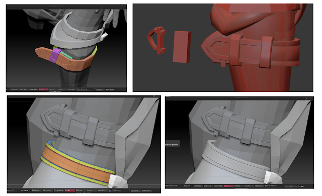
Armor modeling: Using both 3dsMax and ZBrush. For some actions, it is easier to stay in ZBrush e.g. on the right picture, I needed the shoulder guard to be symmetrical - I could do that in 3dsMax but Zbrush essentially has the same function if you put the subtool in the middle of the scene/symmetry axis and overall that proved to be a faster solution than waiting to get my assets to 3dsMax through GoZ. For some actions like edge extrusion and better control of topology, I chose 3dsMax because ZModeler couldn't offer that amount of control.

Keep it simple & clean: I'm already trying to think ahead and save myself from certain headaches with retopology. I model with the most simple, basic tools like CurveStrapSnap and use a lot of polygroups which allow me to affect only the areas that I want to affect. I do the more detailed stuff in 3dsMax. I put a lot of time and effort into keeping things clean, mainly because, for example with the belt, it is an asset which I will likely reuse in my future projects and having a clean base will allow me to create possible iterations faster. In ZBrush, I usually use DynamicSubdiv as soon as I can to catch any problems with topology. I played with some creasing and subdiv settings and I think I get the best look from the following setup:
- Crease level set to 2
- SmoothSubdiv level set to 5
I choose to use DynamicSubdiv instead of actually subdividing because my laptop is a true grandpa and gives me a BSoD whenever I forget to turn on my cooling pad while playing Witcher, or when asking it to handle more than 1 mil ActivePoints in ZBrush :D

Iterate within reason - keep the feel of your concept and detail distribution in mind: This is one of the iterations I went through when trying to adjust the concept. I wanted to follow the look from the Wild Rift Model Viewer and tried to design some hextech-y ornaments to add more interest but ultimately, when I zoomed out, I my eyes kept sliding to her legs rather than her face, probably because I added a lot of belts to that area already and it felt too busy. I decided to re-design the whole area and added a boot with some simple lining which I think created enough interest through the geometrical shapes but did not make it too busy at the same time. I also reminded myself that Championship Ashe has more of a historical/regal warrior feel and I wasn't sure if the ornaments I designed conveyed that feeling.
Adding polypaint can help tune out shape design and get out of tunnel vision: After few days of work, I started noticing that I'm getting close to that moodling mode which I always try to avoid. Pushing polys, endlessly changing shapes which actually might have worked... Normally I would have probably taken a break but because I'm on a tight schedule, I decided to try a workaround and see if adding a bit of colour may help, and boy it did. An hour or two with polypaint gave me a fresh look on my composition and shapes. It was easier to see what will or won't work when textured and overall, it just feels nicer to continue sculpting on something resembling a good looking lady rather than a blank manequin :D
I also noted some solutions from my troubleshooting - I like to Polypaint with Layers because I can erase/tone down things easily, but when I first tried it on my Ashe, every new layer I made just insta-turned the model into a pure black color. First I thought it might be because of UVs but even unwrapping the subtool in ZBrush had no effect. I googled and dug around a little bit and I found out it was because my subtools weren't subdivided but had DynamicSubdiv on. As I said, my laptop is a granddad so I only used Layers when polypainting the face, few hundred thousand polys points can be handled.


