FMP Kled: Final texture overpaint
Taking some time off from my Kled project has been pretty beneficial. I noted down some errors I haven't seen before and also got some amazing feedback from the kind people of Handpainter's Guild Discord and especially Miki, whose feedback rekindled my enthusiasm for the project. Later on I received great additional feedback from Ryan Ribot which I tried to apply below.
The main project I'm working on is still my PBR ashe (blockout post under this one), currently refining her armor!
The main project I'm working on is still my PBR ashe (blockout post under this one), currently refining her armor!
Feedback: adressed
Kled
- Model in more of an expression into the face, move the eyebrows down to give him more of a mean look, also add shadow under eyebrow and near eyes to sell the form
- Add shadow beneath the nose
- Add more form into the beard, think of it as a one big form. Push the sides in by adding shadow.
- The golden tooth could be a bit more saturated/emphasised
- Slightly suggest folding on the pants to break up the even look
- Increase the lightness on top of the ears, darken the bottom again, think of it as a big form
- Emphasise the blue patch, shadow beneath it
- Add purple colour to the hat, as seen in the concept, messy texture
- For the hat, make the top lining a bit more gold. Looks too similar to the fur colour.
- Add light to the top side of the glove (3dCoat Color Dodge)
EDIT: Additional feedback from Ryan Ribot
- Head should be lit more like a ball, more light in eyebrow area as well
- ambient occlusion: push it and add a colour to the shadow
- e.g. pants: rich purple in the shadows would be nice
- gold buckle: too bright (against dark background), tone it down
- there should be a gradual transition in value from top to bottom, darken the boots
- don't forget to add ambient shadow at the intersection of two surfaces (e.g. boots/pants)
- add folding to pants
- coat: currently one flat colour, add volume, e.g. darkening the sides
- light arms and legs like cylinders

Skaarl
- Push the shadow on the bottom of the chest further
- See the concept for the planar change on top of the eye, add that in
- Add the scratch/scar to the top of the head. Great Whites are less polished.
- The top of the head is too flat. Add scratches, lighter details, fish-like texture with color variation.
- Darken the eye, add highlight and indicate the pupil
- Add highlight to the leg, top of the tail
- Take the desaturated browns from the saddle and add them to the blues in the face. Making them pop really nicely! Desaturated values next to your saturated ones will make them pop.
- Add slight colour variation to the nails, they all look kinda same
EDIT: Additional feedback from Ryan Ribot
- Can't see the hook and metal stirrups: change value and contrast
- Darken the legs
- Overall, use value to distinguish different parts of the model. Grouping values is a thing to always keep in mind.
After a lot of great additional feedback from Ryan, mainly focused on contrast and value, I wanted to do a third pass on Skaarl; I worked with a black&white overlay for a bit, trying to push and distinguish the different elements in values. I found I am learning a lot about values and readability throughout the whole project. I also tried to clean up some of the areas I saw as messy (sometimes it takes me a few days away from the project to re-set my brain and get out of the tunnel vision :D Wish there was a button for it!).

- See the concept for the planar change on top of the eye, add that in
- Add the scratch/scar to the top of the head. Great Whites are less polished.
- The top of the head is too flat. Add scratches, lighter details, fish-like texture with color variation.
- Darken the eye, add highlight and indicate the pupil
- Add highlight to the leg, top of the tail
- Take the desaturated browns from the saddle and add them to the blues in the face. Making them pop really nicely! Desaturated values next to your saturated ones will make them pop.
EDIT: Additional feedback from Ryan Ribot
- Can't see the hook and metal stirrups: change value and contrast
- Darken the legs
- Overall, use value to distinguish different parts of the model. Grouping values is a thing to always keep in mind.
After a lot of great additional feedback from Ryan, mainly focused on contrast and value, I wanted to do a third pass on Skaarl; I worked with a black&white overlay for a bit, trying to push and distinguish the different elements in values. I found I am learning a lot about values and readability throughout the whole project. I also tried to clean up some of the areas I saw as messy (sometimes it takes me a few days away from the project to re-set my brain and get out of the tunnel vision :D Wish there was a button for it!).

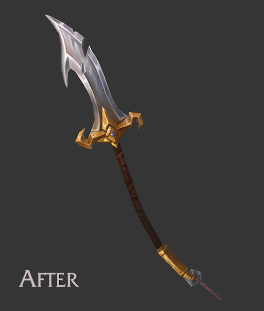
Sword
- Push the contrast in the metal, emphasise the planar change by adding shadows
- For presentation, think about the direction of the light. With non symmetrical parts of the sword like those on the handle, add shadows cast to the unlit part (figure out after posing)
- Push the contrast in the metal, emphasise the planar change by adding shadows
- For presentation, think about the direction of the light. With non symmetrical parts of the sword like those on the handle, add shadows cast to the unlit part (figure out after posing)
- Add a little bit more interest and detail to the plain steel part (e.g. cuts, scratches) but not too noisy
- Use Navigator in Photoshop to check the zoomed out version and think about bigger forms
- Add more highlight to the top of the sword: Color Dodge layer from 3DCoat, bring to Photoshop, don't use white, more like mid grey
- Add more highlight to the top of the sword: Color Dodge layer from 3DCoat, bring to Photoshop, don't use white, more like mid grey
- Add a little bit of light on top of the handle, too flat at the moment, emphasise the cylindrical shape, again think of the lighting when posed
Applying feedback - gif:
Applying feedback - gif:

Overall
- For final presentation, consider not using the League of Legends Fanart logo at all in the thumbnail, it should be apparent what it is from just seeing it.
- Also use less saturated background so that parts of the model don't sink in.
- For final presentation, consider not using the League of Legends Fanart logo at all in the thumbnail, it should be apparent what it is from just seeing it.
- Also use less saturated background so that parts of the model don't sink in.


Comments
Post a Comment