FMP: Week 3 - Kled Hand-Painting
Once again, I'm faced with the most challenging but most fun part of making a stylized character; handpainting. To my great luck, I also have access to Katia Bourykina's amazing tutorial series on Artstation which is super in-depth and helpful. Though Katya's tutorial describes the greyscale to gradient map workflow, I won't be working with gradient maps this time around - but I still noted some tips that stood out to me:
- Lighting: From top, more visible on outer parts of the model. Bounce in the inner parts.
- Gold to gold bounce: if two gold pieces intersect, make sure to create a flattering bounce in the shadow -> brighter orange? Very soft though.
- Don't forget to clean up your masks!
- If you do gems, don't forget subsurface scattering (find ref for the specific rock you want to emulate).
- Contrast the colour in shadows. If the form base color is orange, consider blue-ish purple-ish shadows. I chose purple because I wanted the shadows to read more cohesively with both Kled (mainly orange coloured) and Skaarl (very blue turqoise) and blue shadows would probably be boring on her but I'm going to add some orange accents and bounces into Skaarl's shadows as well.
- When doing dodge on gold, keep it yellow because white will blow it out. White is good on dodging steel.
 |
| Starting in 3DCoat, baking out AO which I will probably only use in the end as a Multiply, almost transparent layer. I find it's good for early orientation in forms. |
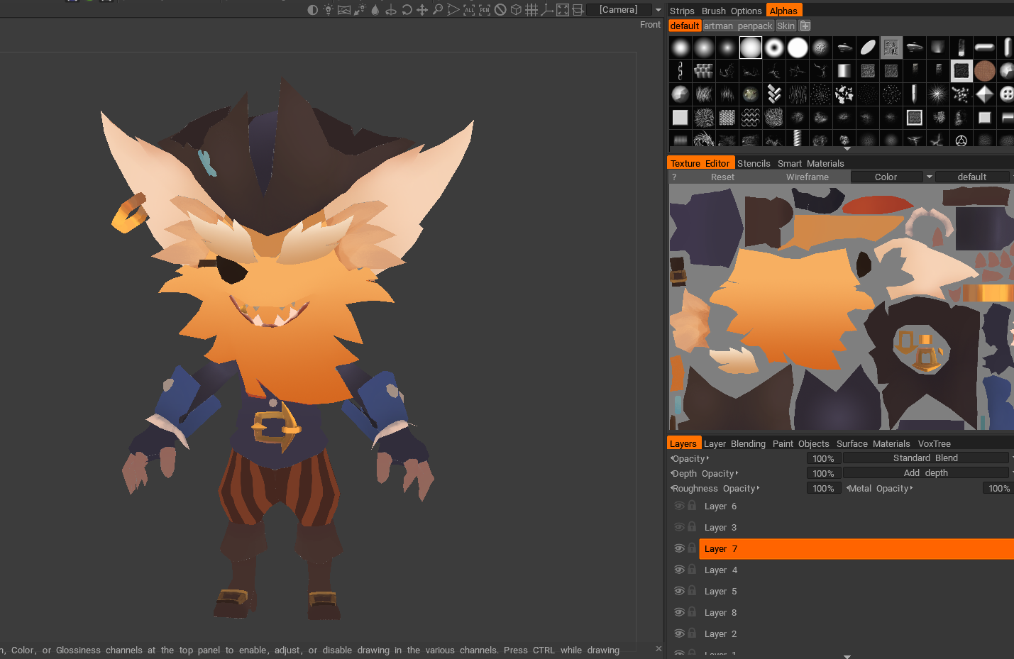 |
| Blocking out base colours in Photoshop. Most of them are colour-picked from the concept but I tried to pick closest to what I thought is a base value, not affected by lighting info. |
 |
| Overpainting, adding forms. This is more of a hands-on approach than what I used with the Kai'Sa concept where I blocked out values first. If I did not have a good descriptive concept, I would find it much harder and probably would not have opted for the direct painting in that case. I like the painterly feel this adds to the texture, it feels a bit more organic and fun. |
 |
| Blocking in the eye and more values. I also had to go back to 3Ds max and push some geometry+reunwrap, mainly in the case of the hat which did not sit well from all angles. I also added some loops and verts - I am way under my budget so it wasn't that big of a deal - the Replace Geometry tool in 3D Coat is a life-saver. Finding a compromise between tri count and decent look of the model in-game is something I had to keep in the back of my mind at all times - I am not sure if I did okay in that area, will have to ask for specific feedback on this. |
 |
| Rendering the pants - value and saturation drop the closer it gets to the bottom of the model. |
 |
| Pre-feedback model. I don't like the black in the shadows, I need to address that. I should also push some colours more than in the concept I think. I already started working on Skaarl and she (oh yeah I just found out it's a she!!! I had no idea! :D) is going to have much more vibrant and saturated accents on her. I will wait to have finished her before I go back to Kled and will try to tone the two together so they look cohesive. |
Points of feedback to address:
- Add pink/white tones into the beard as seen in the concept, it should have more of a gradient.
- Tone the gold into one hue, more of a rose gold than the green/yellow-ish hue
- Tone down the saturation of the cross, make it look more fabric-ky. It should still be a similar hue to Skaarl's skin, but make sure to remember Skaarl's skin is more specular and fabric will render differently.
- Add more purple tones to the shadows
- With rigging, have a look at Blendshapes in Maya
What I am finding really challenging is that the colours look so different on different screens. I am using a laptop + an older Cintiq at home and a computer + a newer Cintiq in our study labs and every time I open the file, the colors look strikingly different on each screen. I was told the CintiQ screens are not the most accurate which complicates things. I think to tackle this, I will do an overlay of black&white to check values first - after all, with values figured out, I should be able to get away with any colour. I should have probably done that earlier as well but I didn't know how to do it in 3D Coat. Luckily a new video by the master of colour, Marco Bucci, just came out where he described a super simple way of how to do this - can't believe I haven't thought of that :D After I sort the values, I will probably colour check on one of the better computer screens in the labs.
So far it's going fine, I guess. I'm at the point where I hate everything I make and I feel like a failure. But that's part of the journey, isn't it? Fortunately, League songs are super motivational and when I'm overwhelmed, I can always have a game of TfT and study the models while doing that :D (Btw. I reached Platinum 1! :D Probably won't ever get to Diamond but it's nice to see I'm still able to climb :D If by any unlikely chance any TfT players are reading this, hit me up and let's play a game!)


Comments
Post a Comment